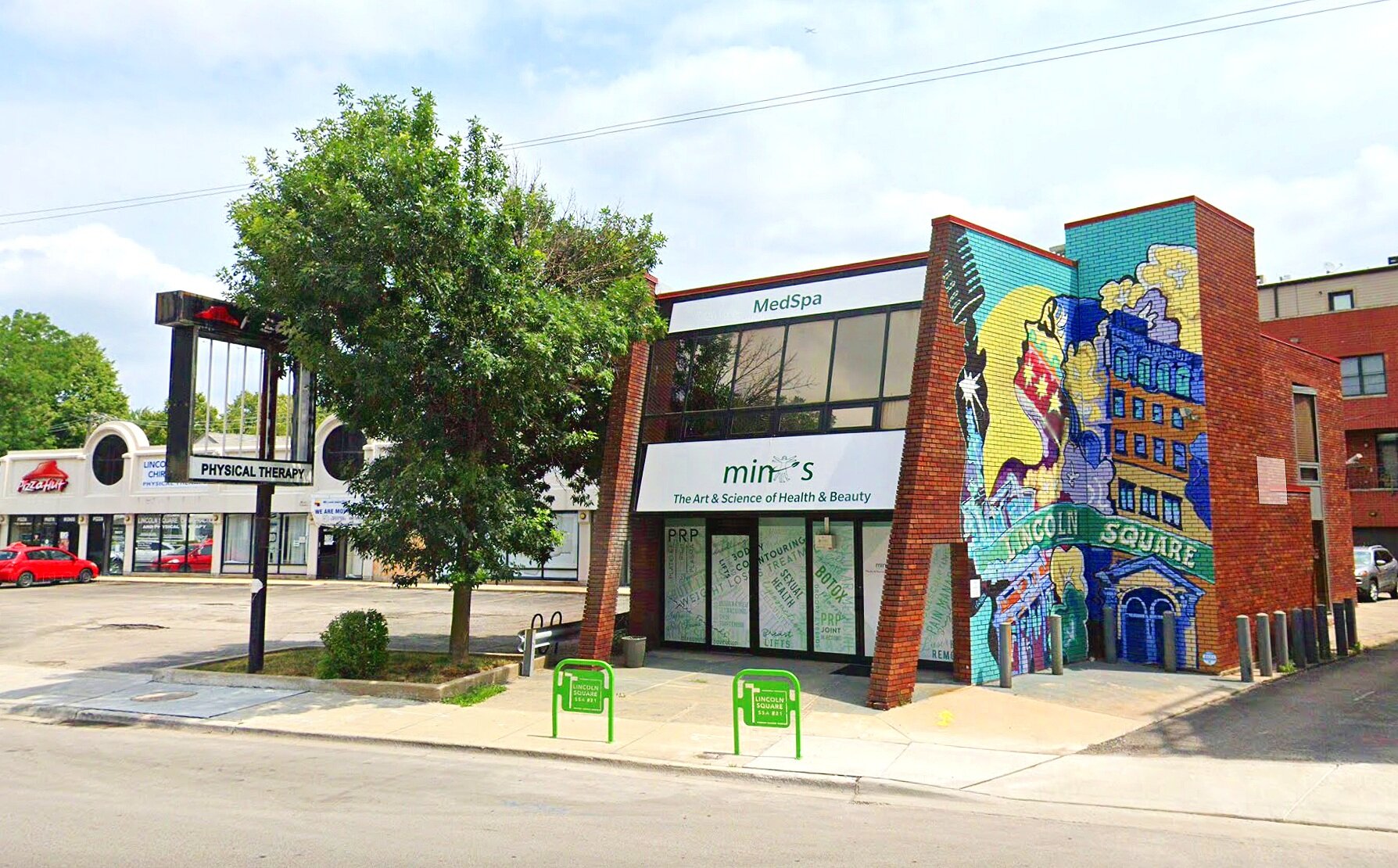
Mint’s Medical Spa Window Display
For MINTS Medical, I revamped their existing logo and designed a new storefront window display that showcases their range of medical spa services. The updated logo preserves the brand’s essence while offering a fresher, more modern look. For the storefront, I integrated key service offerings - such as pain relief treatments, varicose vein care, and cosmetic enhancements - into a sleek and cohesive design that effectively communicates the breadth of their services. The result is a modern, professional aesthetic that aligns with MINTS Medical’s mission of delivering exceptional care.
LOGO REVAMP
MINTS asked me if I could update their logo for them - make the man less grumpy looking, less blurry and bolder in the design. I also made the man younger, seeing as how this practice is all about that! I had to start the logo from scratch, since MINTS unfortunately didn’t have any of the original working design files, but in the end, it was definitely worth it.
BEFORE

AFTER

FINAL DESIGN CLOSE UP
WINDOW STOREFRONT DISPLAY DESIGN
MINTS wanted a logo update as well as a storefront window design. For years of having clear glass panels inviting people into their establishment, they wanted to draw people in with a completely different approach, after realizing too many people just kept walking past them. Their goal was to attract passers-by into their storefront using a “chaotic” busy look, essentially forcing people to look their way. I took their thoughts and ideas, and by emphasizing a lot of bold, dynamic typography, as well as utilizing a lot of different colors in the same color scheme, I came up with something that had that “chaotic” big, bold design, but still remained readable and organized.
DIGITAL MOCKUP

THE REAL THING